Blackbook by Embark Beyond
Product Design Case Study
OUR BRIEF
When I was initially brought onto the project by the Embark Beyond team, the brief was fairly simple:
Redesign the Embark Beyond Intranet (Embark Insider) so that it can be migrated to their existing Blackbook by Embark Beyond SaaS platform, update the UI design of the Blackbook platform, and ensure that everything aligns with their newly redesigned company branding.
MY ROLE
My role was to lead the product design from discovery to launch, working closely with the Director of Technology and the Senior Software Engineer to develop a product roadmap, development backlog, and tech stack requirements.
KEY CHALLENGE
Establish Embark Beyond As The Source-of-Truth for Luxury Travel
Our primary goal was to create a singular product that established Embark Beyond as the go-to resource for agents to book luxury travel and for vetted, white-label businesses, resorts, and travel partners to reach new clientele. Our challenge was ensuring that our singular product provided an elite experience to two distinctly different users with very different needs.
Merging Two Platforms Into A Singular B2B SaaS Product
Our primary challenge at the start of our project was to technically integrate a partially developed SaaS platform, specifically designed for businesses in the luxury travel category, with an intranet website built in WordPress, targeting Embark Beyond travel advisors. When initially brought onto the project, I was told that a few simple templates would very easily help them transfer their entire intranet database into Blackbook. Upon reviewing the intranet site, I quickly realized that the depth of data, range of user needs, and lack of consistency throughout the site's architecture would make the initial product plan inefficient when considering the larger business goals of the product, as well as its ideal timeline.
I regrouped with the Director of Technology and the Marketing Director, who had brought me on for the role, to gain clarity and raise my concerns. We realized that the teams had been working in silos, with the product team focused on Blackbook and the marketing team owning their Insider intranet site. This led to each team asking for what their respective areas of the product needed without fully considering the other half.
Thankfully, this was resolved fairly easily. I developed a new product plan to propose to the founder of Embark Beyond for approval. What initially began as a two-part product plan evolved into a singular, holistic product roadmap, giving us the opportunity to conduct a thorough discovery of both existing platforms in relation to our MVP goals.
Embark Insider Platform Homepage

UX DISCOVERY
Business Owner & Executive Team Interviews
To start our discovery process, I met with the founder of Embark Beyond, the Directors of Technology and Marketing, and the key marketing lead managing Insider, to dive into the business goals, the technical and experiential goals for the product, what existing and future KPIs will be utilized to measure our success, our existing and ideal users of their platform, and the features required to meet our user’s needs and reach our set goals.


Initial Takeaways
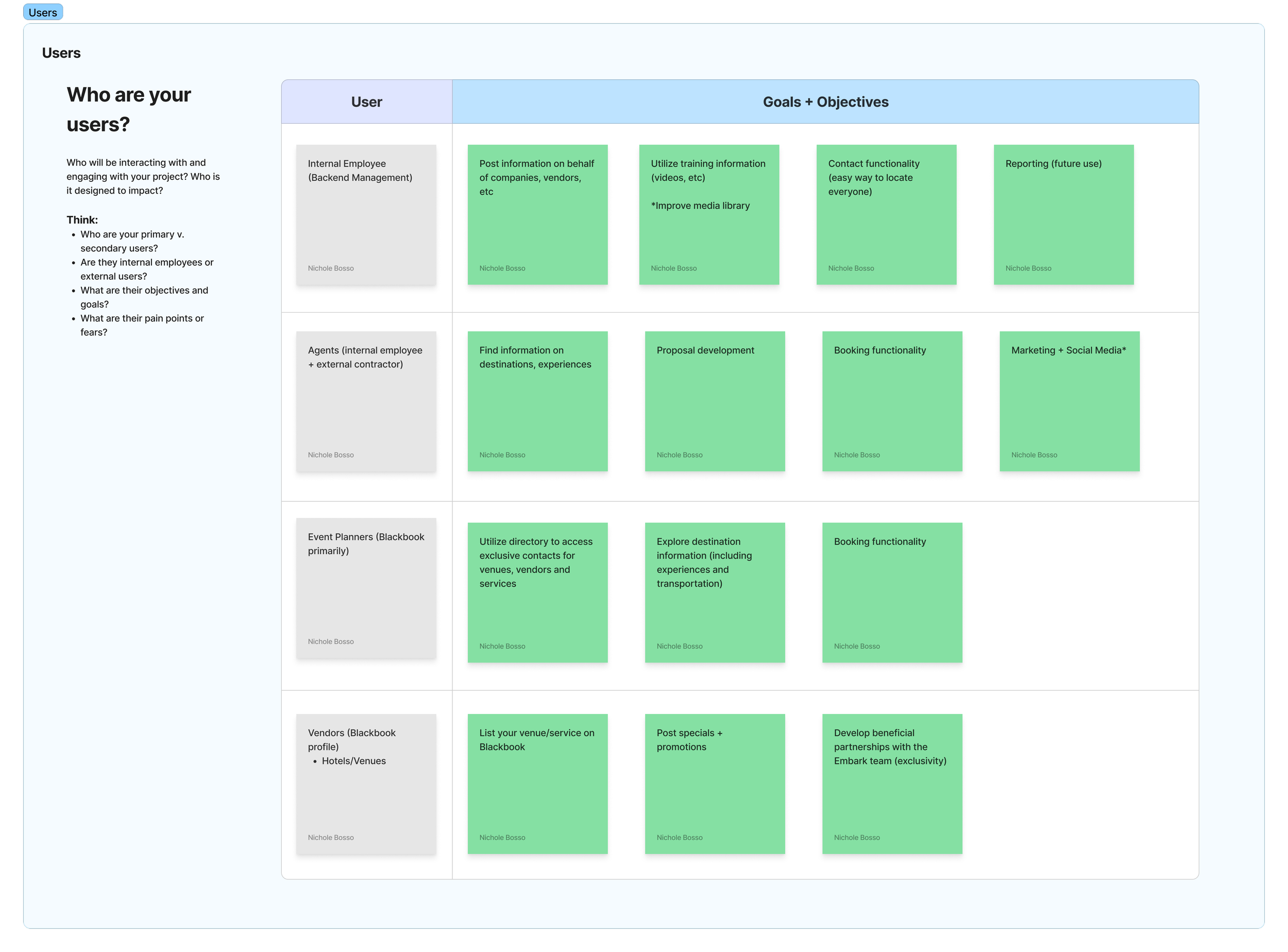
We have four distinct user categories with different priorities:
Internal Employees (Create & Organize Platform Content)
Travel Advisors (Efficiently Find the Best Travel Deals for Clients)
Vendors (Promote Their Business & Manage Their Promotions)
Event Planners (Gain Access to Exclusive Venue & Vendor Deals)
We need a solution for data hygiene (old data, orphaned data, redundancies).
Our existing tech stack is not robust enough to meet user needs. We need to identify integration opportunities to support our back-end and provide a better front-end experience. Our key priority is an AI-powered search tool.
Platform Audit and Site Map Review

Taking our initial discovery and research, I conducted several rounds of interviews, a UX survey, and a focus group to gain insights into our users experience with the existing product, learn more about what they need to be able to perform their jobs, their ideal platform features to assist them, and most importantly, to confirm whether or not our initial takeaways conflicted with our user’s feedback.
UX Interviews, Survey & Focus Groups
Once we gained clarity on our foundational goals, target users, and feature requirements, I began a detailed audit of the existing Insider and Blackbook platforms. This consisted of digging through the front and back-end of each site, mapping every page, key features, API integrations, information architecture, connected points of data through their CMS, as well as backlinks to external platforms.
Throughout this process, I interviewed both the product team members on the tech stack and authentication requirements for Blackbook, and the marketing team member responsible for maintaining the content on Insider to understand what areas of the site were migrating and which needed to be retired (and why).
New Learnings
The Client Comes First When Viewing Promotions
Our assumption that enhanced commission details ranked higher than booking special information for advisors was wrong. We assumed that venues with higher commissions would be important to advisors, with that data ranking equally or higher when weighed against venue booking specials. Advisors were adamant that although this information is nice to have, it has little to no impact on what venues they pitch to their clients, and that they instead prioritized booking specials. When surveyed, < 1% of advisors considered it important (and only when choosing between venues), and 50% said they didn’t consider this information at all.
Advisors Want Recommended Experiences & Restaurants Too
There was an assumption that information regarding transportation, travel advisories, and venues was most important to advisors when crafting client itineraries. Instead, we learned that restaurants and experiences were something that advisors craved, especially in relation to the venues their clients are staying at.
Challenge/Roadblock
One major roadblock we ran into during our in-person/virtual focus group interviews was that we weren’t always able to get clear data. With the business owners present, we did run into some human moments of advisors and team members changing their opinions to align with the executive stakeholders. Our survey responses gave a clearer view, but our in-person data was still useful.
STRATEGY & PLANNING
Feature Mapping, Authentication Planning & Finding Solutions
Once we established a full understanding of the data being migrated from the intranet, the user priorities and challenges, business goals, and our technical needs in contrast to our existing infrastructure, my next step was to outline our Feature Map, organize those features based on user authentication requirements, and begin finding solutions to our existing pain points.
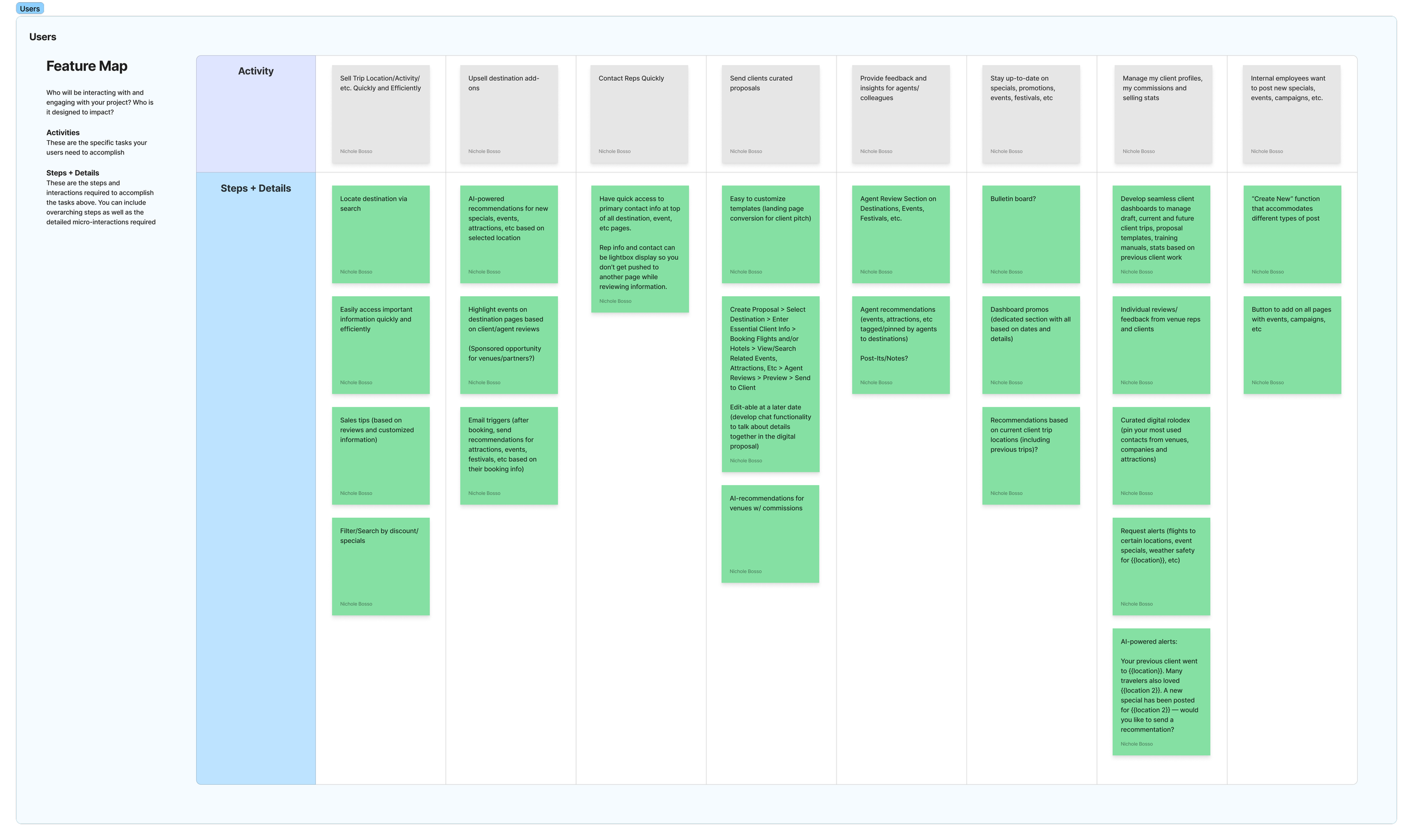

KEY FEATURES & SOLUTIONS

Algolia Integration
The Problem: Users are having a hard time finding the information they need, quickly.
The Solution: Integrate Algolia into the back-end of Blackbook via Strapi API.
Why: Algolia helps organize our platform records via AI, which then provides a smoother, smarter search experience for our users. Through typo tolerance, suggestive search, and federated results, our users can now search for both directly related results as well as curated results by the expert Embark Beyond team.

Data Architecture for Specials & Commissions
The Problem: Booking Specials & Commissions are hard to find and aren’t up to date.
The Solution: Redesign the back-end infrastructure and user flow of posting specials and commissions to link new data to existing company profiles within Blackbook.
Why: When the platforms were separate, all of the booking specials and enhanced commission rates were posted on the intranet as rich text data. This made the information difficult to find on the front-end, and oftentimes created orphaned data on the back-end. Now that we’re integrating these details into the existing Blackbook CMS, we’re able to tie specials and commissions to existing company profiles, making this information easier to find on profiles, in search results, as well as destination guides which feature those companies based on location.

Destination Guide Content Consolidation
The Problem: Previous Destination Guides were long, hard to navigate, and had very little consistency when it came to order of content and structure.
The Solution: Create a feature that allows for a variety of content, but utilizes category tabs to both contain and navigate between each section.
Why: Users had a difficult time finding the information they needed based on content category and were overwhelmed by the format and length of the page, oftentimes leading them to simply not use the guides, and instead text fellow advisors or search online. With this feature, we’re able to not only cut down the overall length of the guides, limiting visual overwhelm, but also add consistency in the structure of the data throughout the guides, providing clarity and building a level of trust in our expertise through our platform’s UX.

Interactive Map Feature
The Problem: Advisors want to plan their client itineraries based on how far away experiences and attractions are to their booked hotels and general city landscape.
The Solution: Create an interactive map feature to highlight Embark Beyond recommendations based on location and curated rankings.
Why: Whether you’re utilizing the platform’s primary search or are exploring individual destination guides, the interactive map both helps tie all of our recommended venues, attractions and restaurants to a destination, but also integrates with Google API, providing a layer of data hygiene through validation triggers. Not only can we pull in live data from external feeds (events based on location, for example), but we can also highlight personal recommendations to each map via geotags and ranked data. This would remove the need for redundant data in multiple locations, and allow us to display curated pins for every destination guide on a macro and micro level.
DESIGN, PROTOTYPE & TEST
Once I was finished planning new solutions and confirming their technical practicality with the engineering team, I created low/mid-fidelity wireframes for the entire platform. Although I’d traditionally confirm layout before diving into content, our timeline didn’t allow for multiple rounds of ideation. With that in mind, I dove into designing the layout, architecture, functionality and data requirements throughout the platform. I then created a very simple prototype (see embedded prototype below), outlining a single happy path throughout the main areas of the platform.
I presented these screens in two separate reviews to both the executive team of Embark Beyond as well as a focus group of advisors. Although we were overwhelmingly met with positive feedback throughout the entire platform (with small feedback on placement and order of content), we ran into two contrasting points of feedback from the two groups.
Testing Feedback
Destination Guide (Primary Content Feature)
While the advisors loved the new table layout of the destination guides, utilizing the tabs to find categories of information, the founder had the opposite reaction. He preferred the old structure of the destination guides as long-form written guides with an emphasis on quantity of data.
Interactive Map
Much like the table feature, the founder preferred to view this information in a listed format, while the advisors loved the visual ability to see everything in relation to one another on a map.
Solution
Considering the overwhelmingly positive responses from the advisors, we were able to have a long talk with the founder about why we made those changes and how they’re going to benefit the advisors’ ability to do their jobs while also helping us reach business goals by making the guides more digestible on the front-end, and more technically impressive (justifying membership cost and creating long-term opportunities for growth). However, we did make modifications to meet some of the founder’s concerns. Firstly, we made sure there were content features that allow content tables on the destination guides (providing functionality to add lists of content back into the guides in a more digestible and data-driven way). Second, we respected and agreed with his concerns about building the interactive map relating to the product timeline. With that in mind, we moved items such as restaurants and attractions to our phase two, MVP+, roadmap and limited the map to our existing database of venues and experiential travel partners for the MVP launch.
Want to view the interactive prototype? Check out our website on your desktop! For accessibility and loading sake, we’ve hidden these elements on mobile. We apologize for the inconvenience.
HIGH-FIDELITY DESIGN & DESIGN SYSTEM
After all of that planning and testing, I was able to take my low-fidelity wireframes and the updated brand guidelines and deliver high-fidelity designs for the entirety of the platform as both mobile (430px) and desktop (1440px) breakpoints. This included 11 Content Categories (Homepage, Destination Guides, Directory, Search, News, Calendar, Training Manuals, Loyalty Program, Blackbook Company Profiles, Blackbook Directory Profiles, and Admin) with 115 screens for the platform’s Admin experience alone. The overall process not only resulted in a luxurious front-end experience for the user, but also completely redesigned the back-end of the product to emphasize a cleaner, leaner, and more dynamic infrastructure.
Alongside the high-fidelity renders, I also created a robust design system for the Embark Beyond team to utilize as they grow and to make development much smoother. My preference when creating design systems is always to include visual examples, content information, interaction details as well as ensuring my components are active and ready to use in the future. You may view this in detail in the embedded Figma file at the bottom of this page.


Want to view the full design system? Check out our website on your desktop! For accessibility and loading sake, we’ve hidden these elements on mobile. We apologize for the inconvenience.
FINAL IMPACT
The redesign created immediate improvements in both usability and scalability. In early testing, advisors reported they could find vendor specials and destination content much faster, while internal employees noted that the new CMS structure streamlined content entry and reduced duplicate work.
By aligning the platform with advisor priorities and vendor needs, we established a stronger foundation for sustainable growth. The phased roadmap ensured a robust MVP could launch quickly while leaving space for additional features, and the design system now enables faster, more consistent product development.
Looking ahead, key success measures (such as advisor adoption, platform-specific promotion usage, and paid member growth) will help track long-term impact as the platform expands.
Have additional questions? Feel free to email me at hello@secondsisterdesignstudio.com.